
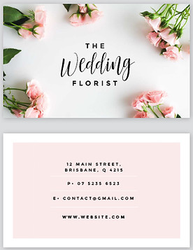
The designer of this business card has used the white box as a way to make the important sections stand out against the background. The straight lines around the white box defines and divides the shape.
This business card makes use of incorporating a photo of real roses in the background. The roses aren't symmetrical from side to side but they are balanced even though there are less bunches on the right side they are larger in size therefore both sides look full but not cluttered.


This business cars is very plain although the text is quite busy as there are many different fonts. I also wouldn't chose a design such as this one as there is not enough colour variation.

The use of the visual texture has been used by the designer to capture the customers attention as the texture is tactile and it makes you want to touch it. The ink print looks good on the larger font, although as the font gets smaller it begins to look messy and not easy to read.
This design is extremely eye catching as the circles create a rhythm. This rhythm draws the customers attention through the circles eventually reaching to the name in the middle. For the back of the card the colours are simply inverted and the background it white with a grey circle. This is a good idea as it breaks up the flat grey colour.
The lettering in this business card has been embossed which gives a bumpy different texture. Seeing as the card is very basic with lettering and a symbol, the embosses lettering captures the customers attention as it is different.


The rhythm on this business card flows throughout the background adding character. Whilst keeping the front busy and eye catching the designer can then chose to have a simple design on the back of the card. This card stands out a lot amongst others.
The pattern on this business card has been executed nicely as it is being followed through from the front to the back, although it does look busy. The designer has used the same colour structured pattern from the bottom half by using the same yellow background colour.


The contrasting colours, black and white, used in this design really captures your attention. It fits in well with the polka dot pattern and the business of the pattern and contracting colours adds a visual interest.
To seperate the information from the background the designer has placed in black text boxes with rounded off edges to match the round polka dots.