
1.

To refine this post card i began with changing the background colours to solid fills. I used the same contrasting colours on the front and incorporated them on the back.

Next i re-arranged the circles and placed the logo on the left hand side as customers will read left to right and see your business logo first.
I also changed the fonts ensuring that the top and bottom stayed the same then having a plain structured font in the middle to break it up.

2.

For this design i removed the logo from the from of the card as i wanted the text to stand out. Instead i placed the logo on each of the pots on the back of the card.


I then opened up the document and in photoshop i used the bevel and emboss, inner shadow and colour overlay options to create the text look as if it is raised from the page. Next i re-positioned the words to make them look more centred and grouped. I used the Line and ellipse tool to create the lines on either side and added the same text effects.


3.

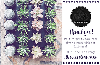
To refine this design i added 'Thank You!' under the logo as i felt that is was missing something. Next i filled up the empty space on the top and bottom by using the ellipse tool to create a row of circles. I then filled them with a similar colour to the pot holder as that is a dominant colour in the image.

4.

For the front design i began with changing the page from horizontal to vertical. Next i added the website handle underneath the logo to show that there is a website.


To refine that back of the post card i added extra text keeping the words 'thank you' in the gold foiled text, to stand out, and the rest plain black.
I then used a thin font for the next section of text as i wanted the top to be the main focus.
In small text underneath i changed the social media handles to black text.

6.

To finish refining my design i decided to incorporate two together as i felt that they flowed. I used the front of postcard #2 and the back of #3. I matched the colours for the text and the ellipses to the front of the post card and ended up with my final design.
