
1.

Using Adobe Illustrator i created this postcard with a plain pink background. I then went in with my desired font and typed 'Thank You'.


I then used the effects, layer style to bevel and emboss the text. Next i added a rectangle using the rectangle tool and turned the opacity down to 25%. Lastly i added the text.


For the from i simply added the logo and the website at the bottom to incorporate the business and social media handles.
2.


To start designing this post card, i began with i set the foreground and background colours to a saturated yellow and a darker almost brown yellow. I created a new layer and used the render > clouds option to set a base for the gold foil text. After this i went to the filter option and added noise to my layer.
I then went into filter > filter galley and clicked the distort > glass option and then chose the settings that i felt looked the best.

Here i placed the gold layer over the text. I then went to layer > create clipping mask and i ended up with the final product.
i chose to keep this post card basic with the essential social media handles at the bottom and the 'Thank You' in the centre as i referred back to my investigating and got the idea from there.


3.

To design this postcard i used an image from my social media account which takes up most of the card. I the positioned the logo at the top right hand corner and the text below it. For the text i incorporated the hashtag that i have used throughout the corporate identity.
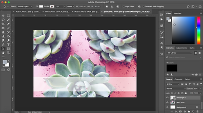

The front of this post card showcases bright colours and succulents, i used the rectangle tool to create a long rectangle. I turned the opacity down to 60% in order for the background to continue to stand out.
Lastly, for the front i added the website link in the transparent rectangle with the logo on the left. I made the logo larger to overhang the rectangle to create layering.


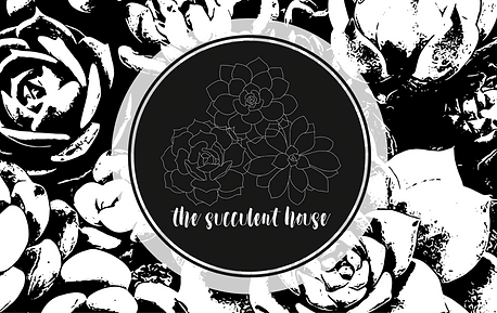
4.

This post card was design to flow with my logo so i used the succulents in the logo and change the stroke colour to black.

Here i copied and pasted the illustrations into lines and filled the page.

I then grouped the lines together, changed the size and copied and pasted more to fill up the page. The last step for the background was to change the transparency to 50% as the front was at full colour.

For the back i simply added a black rectangle using the rectangle tool and turned the transparency down to 60%.


For the front i kept the transparency at 100% and added the logo. The contrasting layers worked well together as the background has more white and the logo has more black.


5.

To begin with i opened up an image in Adobe Capture. For these first three steps i used my Iphone as it worked easier to use Adobe Capture.

Adobe capture then allowed me to turn this image into a black and white vector.

Once the vector was created i smoothed and refined it to look cleaner and sharper

I transferred this image into Adobe Photoshop. I then added an ellipse using the ellipse tool with the opacity at 80% as i wanted the background to still come through.

Lastly, i placed the logo inside of the ellipse to finish off the design.

For the back design of the post card i used the same image, only this time, i kept the image in colour.
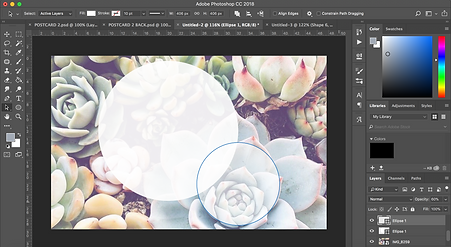

Again, i used the ellipse tool to create two different sized ellipses overlapping each other. I turned the opacity to 60%


To finish off i used two different fonts. I used the bold font 'Hey Pretty Girl' for the catchy saying and a more delicate and thin front such as 'Carlys handwriting' for the information.

6.

To begin with i decided on three different fonts that looked as if they would work together. I then began searching the web for succulent slogans and puns. I found one i enjoyed and incorporated it into my design. Firstly, i chose the first basic font for the first to words. Then the fancier font was used for the 'succa' as i wanted it to stand out more and lastly the other basic font was used for the last two words.

I aimed to keep the front basic to ensure that the logo and text stood out to the customer. Seeing as the is black and white i decided to use grey as the text colour and a more blue grey as the background fill.

For the back design i used an image where the colours were primarily the same as the fronts background.
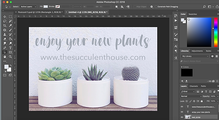
Once again i used two fonts 'Dont Click Me DEMO' and a basic font 'Avenir Next'. For the text i wrote a personal message to maintain relationship with the customers.

